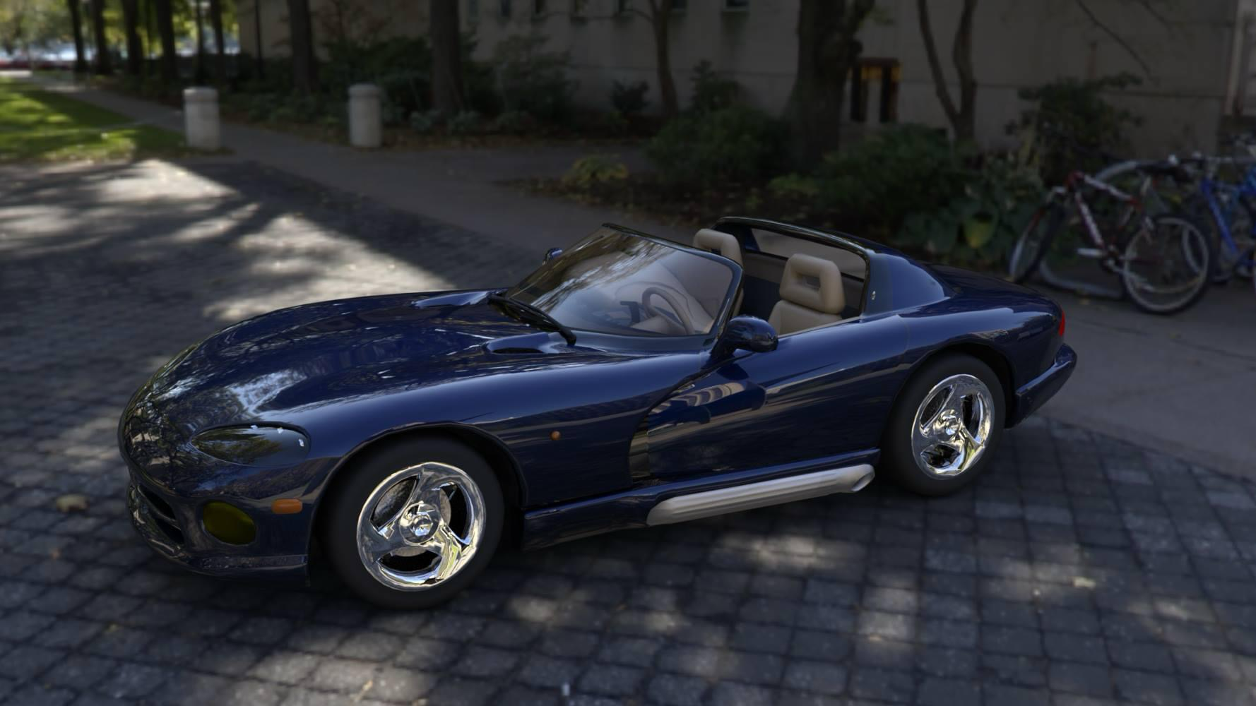
3D Scene
DAZ Studio • lighting • mood
This portfolio is my work in progress Senior Project. I will be working on it for the next 14 weeks Keep coming back for more updates.

A Portfolio 20+ years in the making!
I create fine art, 3D DAZ Studio renders, photography, graphic + web design, and UX/UI work—blending craft and clarity into visuals that feel both imaginative and intentional.
A curated mix of traditional art, 3D work, photography, and design.
A flexible skill set—useful for commissions, collaborations, and full project builds.
Traditional media studies, illustration, portraits, and atmospheric scenes.
Character renders, environments, lighting, and cinematic composition.
Brand visuals, covers, social graphics, and clean layout systems.
Landing pages, responsive builds, and visually calm, readable UI.
Wireframes to polished interfaces, component libraries, and design systems.
Nature, detail, mood—soft color palettes and quiet composition.
A calm, structured approach—so the creative part feels easy.
...
...